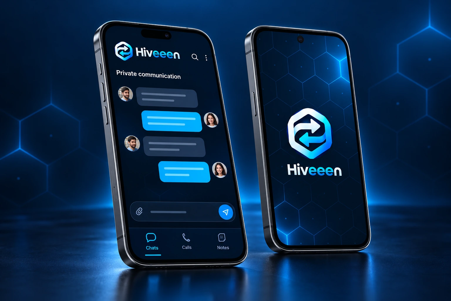
Hiveeen’s visual language combines secure connection, two-way communication and structure. The honeycomb suggests resilience, while the two-way arrow represents conversation between people. Deep navy and cyan complete the calm, technology-focused character.
Hiveeen Journal ·
How the Hiveeen Brand Identity Took Shape
Honeycomb geometry, two-way arrows and blue tones became the foundation of Hiveeen’s visual identity.
Explore our security approach ↗